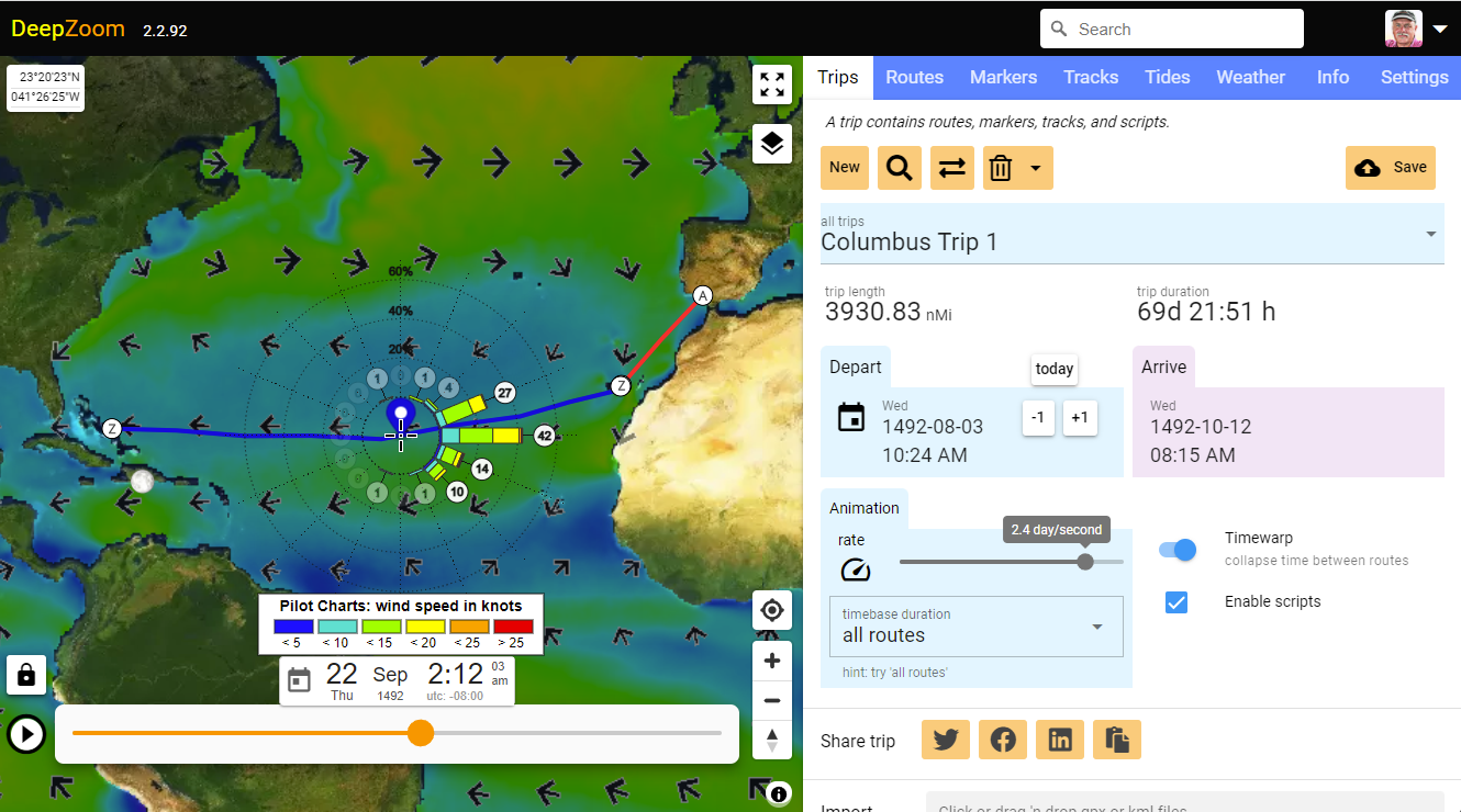
Trip: Columbus sails to America in 1492
Historical pilot charts
Pilot Charts show probabilities of wind strength and direction for a particular location and time, to help plan optimal sailing routes. Historically, these charts were derived by manually collating the logs of thousands of vessels transiting the oceans over the last few hundred years.
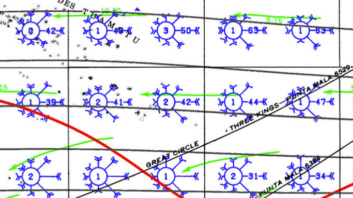
Below is an excerpt from a traditional pilot chart for a portion of the southern Pacific ocean during the month of February. Each windrose covers a 5°x5° area. The length of the barb indicates the percentage of time the wind blew from that direction, and the barb style indicates the strength of the wind.
DeepZoom pilot charts
DeepZoom does the same thing on steroids. Instead of using the ship historical data, DeepZoom uses satellite derived wind strength and direction information displayed as a polar histogram.
The Pilot Charts layer lets you plan a route based on historically measured wind speeds and directions. This layer shows a probability windrose on a color coded background. The background shows mean historical wind speed along with arrows showing mean wind direction for each 14 day period.
Superimposed on this background is a windrose which shows the percentage of time the wind is blowing from each of 16 cardinal/secondary/intercardinal directions. The length of each bar shows the percentage of time the wind blows from that direction averaged over a 14 day period. The length of the colored rectangles within each bar indicates the percentage of time the wind blows with each velocity range.
Columbus trip 1
Here’s a trip showing how Columbus travelled to the Bahamas on his first voyage. The bar from due east ending in the number “42”, indicates that the wind was blowing from that cardinal direction 42% of the time. The wind was under 20 knots about 40% of the time, and there was an easterly component virtually all the time.
Columbus was likely sailing straight down wind most of the westward voyage.
Try it: https://www.deepzoom.com/trip/qe778dsf
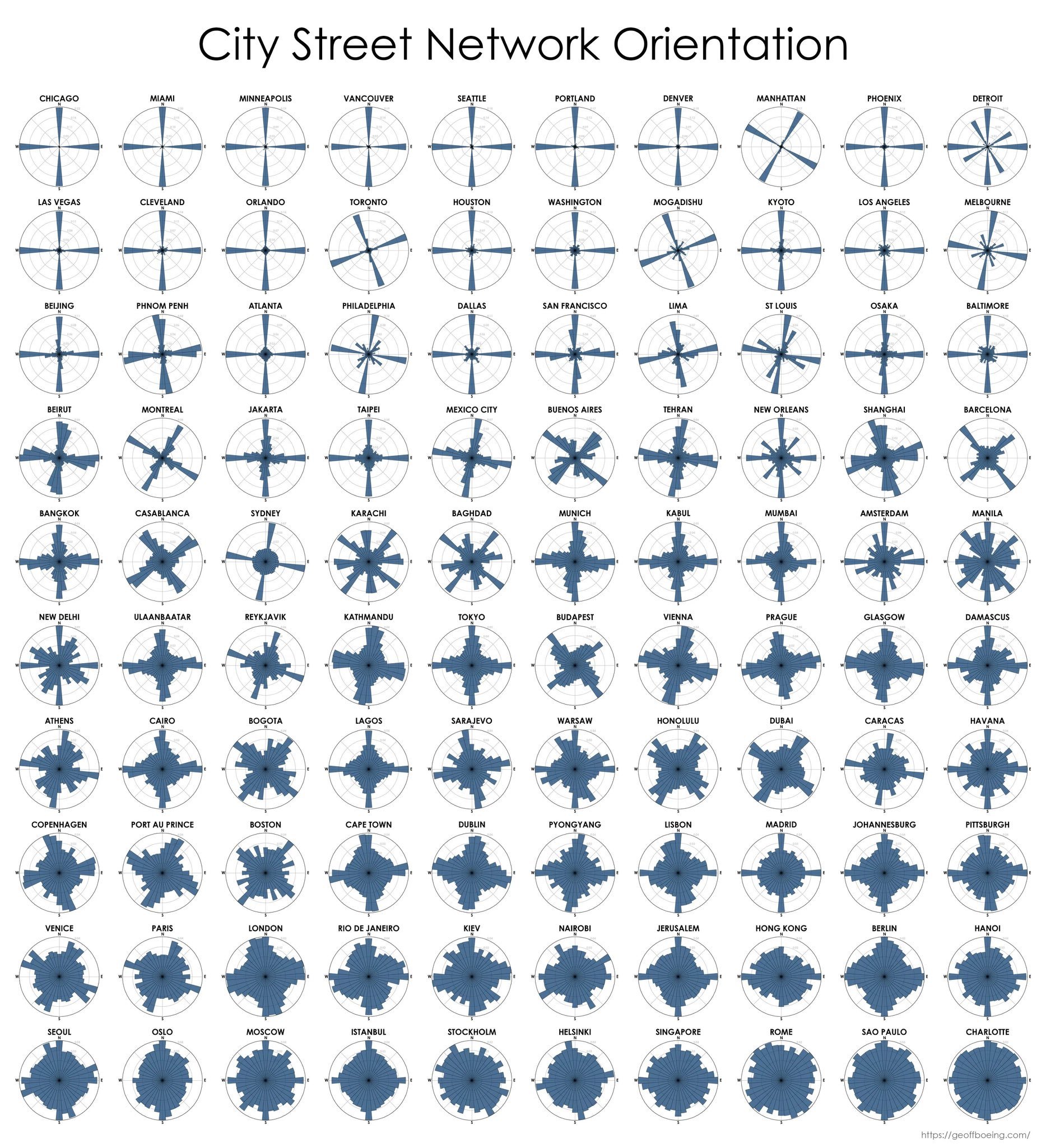
Another cool polar histogram example
Entropy levels of 100 world cities by the orientation of streets.
Most ordered streets: Chicago, Miami, & Minneapolis.
Most disordered: Charlotte, Sao Paulo, Rome & Singapore. Paper: